Pinterest to nie tylko miejsce do przechowywania pomysłów, ale także platforma z charakterystycznym logo, które od samego początku jest integralną częścią marki. Historia zmian logo Pinterest jest dowodem na jego nieustanną ewolucję, dostosowującą się do gustów użytkowników i trendów w projektowaniu. Odkryjmy kolejne etapy rozwoju logo Pinterest, aby lepiej zrozumieć jego znaczenie i to, co czyni je wyjątkowym.
I. Wprowadzenie do Pinterest
Pinterest powstał w 2010 roku, a jego założycielami byli Ben Silbermann, Paul Sciarra i Evan Sharp. To unikalna platforma społecznościowa, gdzie użytkownicy mogą wyszukiwać inspiracje, zapisywać pomysły i planować różne aspekty swojego życia.
W przeciwieństwie do Facebooka czy Instagrama, Pinterest nie koncentruje się na udostępnianiu osobistych chwil, ale na odkrywaniu i tworzeniu pomysłów. Można go porównać do cyfrowej tablicy ogłoszeń, na której można "przypinać" wszystko – od przepisów kulinarnych, przez pomysły na wystrój wnętrz, aż po trendy modowe i praktyczne porady na co dzień.
Na przestrzeni lat Pinterest zbudował silną tożsamość marki dzięki spójności i kreatywności, zwłaszcza poprzez swoje logo. Czy logo Pinterest ma ukryte znaczenie? Przyjrzyjmy się temu bliżej.
II. Co oznacza logo Pinterest?
Co oznacza logo Pinterest?
Logo Pinterest nie jest przypadkowym projektem, lecz skrywa w sobie głębokie znaczenie. Jeśli przyjrzysz się uważnie, zauważysz, że jest to harmonijne połączenie symbolu i przekazu marki.
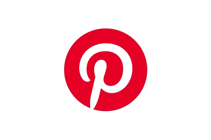
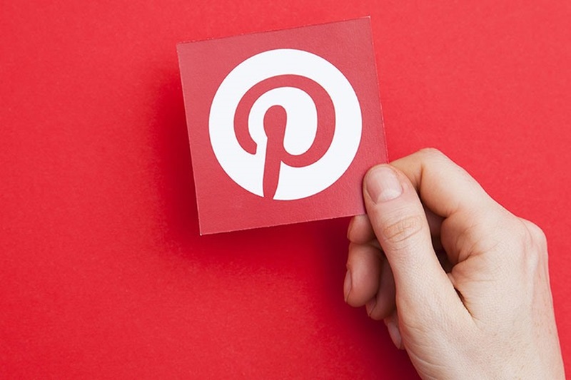
Logo Pinterest składa się ze stylizowanej litery „P” umieszczonej w wyróżniającym się czerwonym okręgu. Jednak tym, co czyni je wyjątkowym, jest sposób, w jaki litera „P” została zaprojektowana – przypomina ona kształt szpilki (pin). Sama nazwa „Pinterest” pochodzi z połączenia słów „Pin” (przypinać) i „Interest” (zainteresowania), co doskonale oddaje misję platformy: pomaganie użytkownikom w „przypinaniu” rzeczy, które ich interesują.
Dlaczego motyw szpilki?
Szpilka to nie tylko narzędzie wykorzystywane w rzeczywistości do przypinania zdjęć czy dokumentów na tablicy korkowej, ale także symboliczne odniesienie. Oznacza zachowywanie ważnych informacji i inspirujących pomysłów, których użytkownicy nie chcą stracić. To właśnie dlatego logo Pinterest zostało zaprojektowane tak, aby idealnie odzwierciedlać tę koncepcję.
Co oznacza logo Pinterest? Reprezentuje ono połączenie, kreatywność i inspirację – wszystkie te wartości wyrażone w subtelnym, ale niezwykle znaczącym symbolu szpilki.
Pinterest nie jest jedynie symbolem marki – jego logo reprezentuje coś znacznie większego. To znak nieskończonej kreatywności i pragnienia łączenia społeczności poprzez inspirujące pomysły.
1. Kreatywność i personalizacja
Pinterest to miejsce, gdzie każdy może swobodnie wyrażać swoją kreatywność i odkrywać treści dopasowane do swoich zainteresowań. Logo, z intensywną czerwoną barwą i unikalnym kształtem, przekazuje jasny przekaz: każda idea zasługuje na to, by zostać „przypięta” i wyróżniona.
2. Połączenie i społeczność
Poza indywidualnym wyrazem, logo Pinterest symbolizuje również łączność. Szpilka nie tylko „przytrzymuje” pomysł, ale także stanowi metaforyczny most między milionami użytkowników na całym świecie. Dzięki Pinterest ludzie mogą dzielić się inspiracjami, uczyć się od siebie nawzajem i odkrywać nowe pomysły.
3. Prostota i przystępność
Kolejnym istotnym aspektem jest prostota projektu logo. Składając się jedynie z okręgu i litery „P”, znak Pinterest oddaje całą filozofię marki w jednym minimalistycznym symbolu. To także przykład zasady „mniej znaczy więcej”, szeroko stosowanej w świecie designu.
Podobnie jak każda wielka marka, logo Pinterest przeszło przez różne etapy rozwoju, dostosowując się do zmieniających się trendów i potrzeb użytkowników. Przyjrzyjmy się historii jego transformacji:
1. Okres 2010-2011: Pierwszy symbol Pinterest
Okres 2010-2011
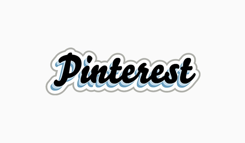
Pierwsze logo Pinterest zostało zaprojektowane przy użyciu czcionki Bello Script, charakteryzującej się eleganckim, kaligraficznym stylem. Symbol składał się wyłącznie z ręcznie napisanego słowa „Pinterest” w czarnym kolorze, otoczonego cienką białą obwódką i subtelnym, jasnoniebieskim cieniem. Choć projekt był wizualnie atrakcyjny, nie wyróżniał się wystarczająco ani nie pozostawiał silnego wrażenia.
Największym minusem tego logo była jego przeciętność. Na tle innych znaków firmowych nie wyróżniało się wyraźnie, co sprawiało, że było mniej rozpoznawalne. Prawdopodobnie z tego powodu pierwsze logo przetrwało zaledwie kilka miesięcy, zanim Pinterest zdecydował się na odświeżenie swojej identyfikacji wizualnej.
2. Okres 2011-2016: Powstanie stylizowanego symbolu „P”
Okres 2011-2016
Rok 2011 był przełomowym momentem dla Pinterest, ponieważ wówczas oficjalnie zaprezentowano nowe, ikoniczne logo. Co oznaczało logo Pinterest w tym okresie? Było to subtelne połączenie koncepcji i identyfikacji wizualnej marki.
Nowy symbol przyjął formę ciemnoczerwonego okręgu z białą, stylizowaną literą „P” w środku, przypominającą małą pinezkę. Ten detal nie tylko nadawał logo unikalny charakter, ale także idealnie oddawał główną misję Pinterest: przechowywanie i przypinanie inspirujących pomysłów.
Projekt logo został stworzony przez dwóch utalentowanych designerów – Juana Carlosa Pagana i Michaela Deala. Mimo że nowa wersja znacząco różniła się od pierwszego logo, projektanci starali się zachować spójność stylistyczną, aby utrzymać silną tożsamość marki.
W tym okresie logo było często używane samodzielnie, bez napisu „Pinterest”. Świadczyło to o jego wysokim poziomie rozpoznawalności, który wynikał z kreatywnego projektu i głębokiego przekazu wizualnego.
W 2016 roku Pinterest ponownie udoskonalił swoje logo, ale tym razem zmiany koncentrowały się na nowoczesności i łatwości rozpoznawania. Co symbolizowało logo Pinterest w tym okresie? Profesjonalizm, nowoczesność i dostępność.
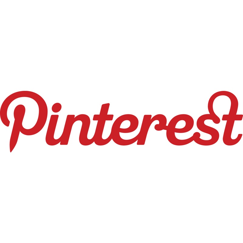
Nowy projekt składał się z dwóch głównych elementów: czerwonego okręgu ze znajomą literą „P” oraz napisu „Pinterest” umieszczonego obok. Użyto pogrubionego kroju pisma sans-serif, a litery zostały umieszczone bliżej siebie, co nadało im wyrazistość i siłę.
Chociaż logo stało się prostsze, zachowało swój charakterystyczny wygląd. Warto zwrócić uwagę na zastosowanie czcionki „Neue Haas Grotesk”, z drobnymi modyfikacjami, takimi jak zaokrąglenie kropki nad literą „i” oraz subtelne dopracowanie litery „s” w celu lepszego dopasowania do całej kompozycji. Te niewielkie zmiany miały duży wpływ na estetykę logo, czyniąc je bardziej harmonijnym i zrównoważonym.
4. Okres od 2021 roku do dziś: Nowoczesne i dopracowane logo
Okres od 2021 roku do dziś
Od 2021 roku Pinterest nie wprowadził większych zmian w swoim logo, koncentrując się zamiast tego na optymalizacji doświadczenia użytkownika i zachowaniu tożsamości marki. Co oznacza logo Pinterest w obecnym czasie? To symbol połączenia, kreatywności i inspiracji – kluczowych wartości, do których dąży ta platforma.
Obecne logo nadal zachowuje okrągły symbol z charakterystyczną, stylizowaną literą „P”, jednak napis „Pinterest” został stopniowo dopracowany, aby lepiej odpowiadać nowoczesnym trendom projektowym. Miękkie linie, prosty, ale wyrazisty kształt sprawiają, że logo pozostaje łatwo rozpoznawalne – niezależnie od tego, czy pojawia się w aplikacji, na stronie internetowej, czy w materiałach marketingowych.